Skybnb
Data Visualization of Fight Delays
Data Visualization of Fight Delays
Flight delays and cancellations are, unfortunately, part and parcel of air travel. When a delay or cancellation occurs, it is indiscriminate about who it attacks and frequently causes stress and inconvenience. While the reasons for flight delays and cancellations are numerous, the overall outcome is the same: a unexpected hindrance to a traveler’s itinerary.
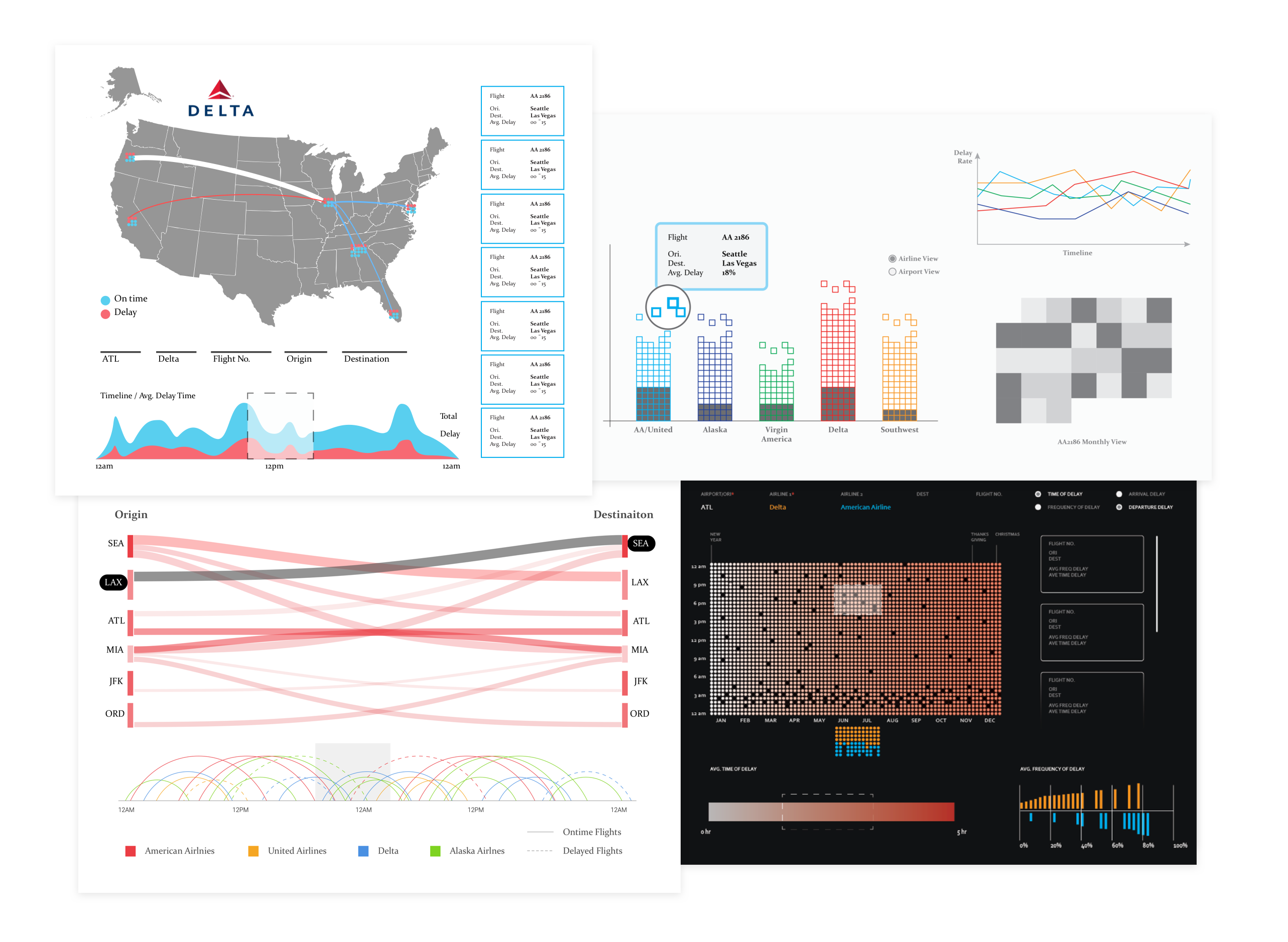
Skybnb visualizes the flight delay patterns of 7 airlines over the year between 10 airports, empowering travelers to make smart decisions when planning trips, and allowing airports to adjust their flight schedules to provide better service.
Our goal is to build a visualization of flight delay data from 2015 with the intent to provide an overview of flight delay length and frequency, allowing for comparison between airline performance and the ability to see delays based on time of day and year on a airport to airport basis. This can be a useful tool for airlines to improve their customer experience and can give travelers a flight prediction system to help plan their trips.
BTS is a statistical agency, the premier provider of up-to-date (latest available data from July 2016) transportation statistical knowledge that offers researchers data that is to a large degree guaranteed in both accuracy and completeness. Data Source
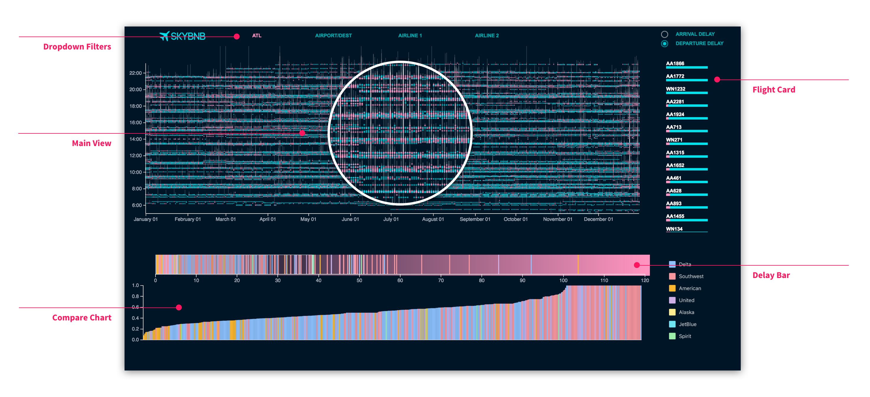
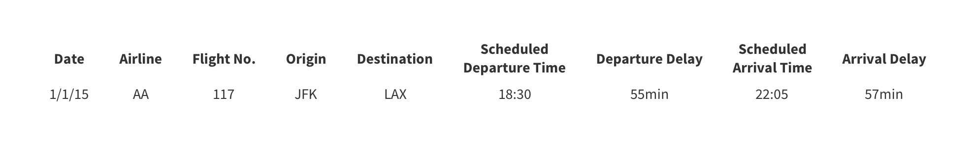
We want to visualize the arrival and departure delay for every domestic flight in 2015 of seven major airlines in the United States of America. Each item represents one flight and has attributes including flight number, date, airline, origin airport, destination airport, scheduled departure time, departure delay, scheduled arrival time and arrival delay. Examples of these items are shown below.
We made it clear that our visualization project would serve as more of an exploratory tool for our target users, to help with flight delay trend/pattern detections over time. Design and implementation of the tool should therefore focus more on the handiness and flexibility of the tool-utilizing experience, instead of providing solutions for specific delay problems, say, offering users flight suggestions to take in order to avoid severe delays.
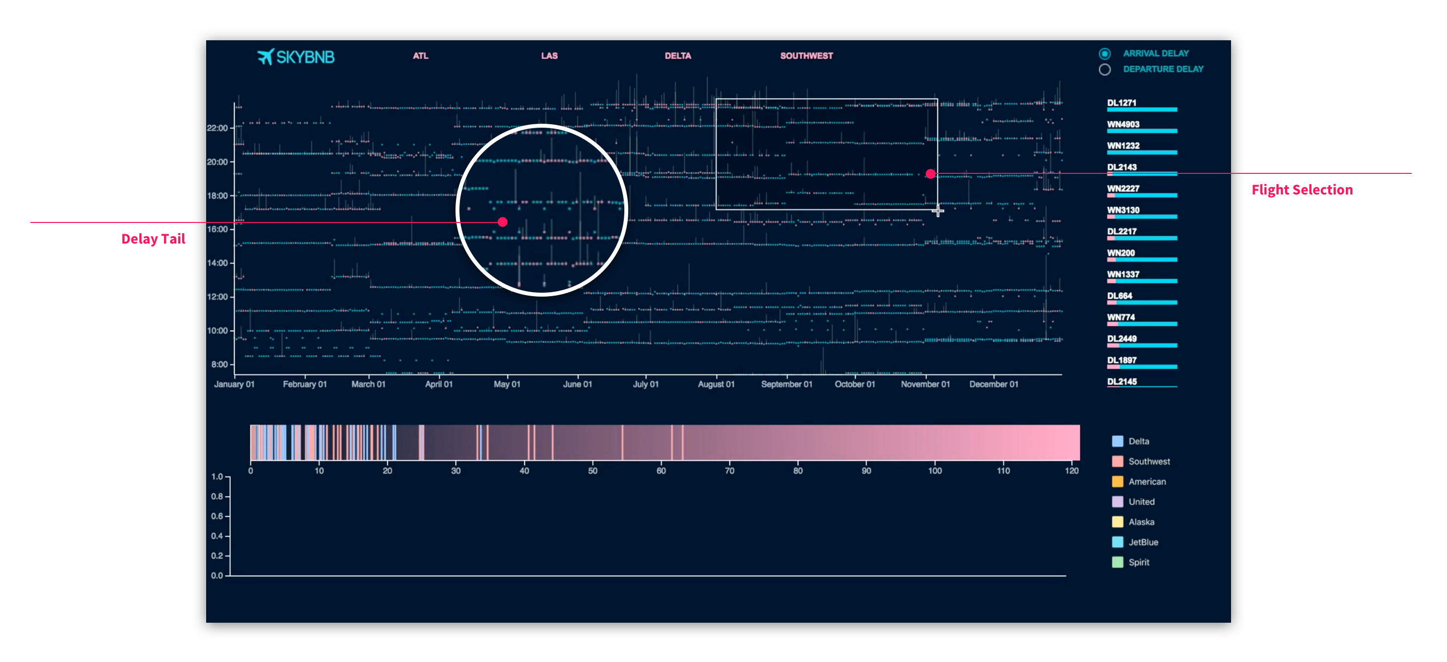
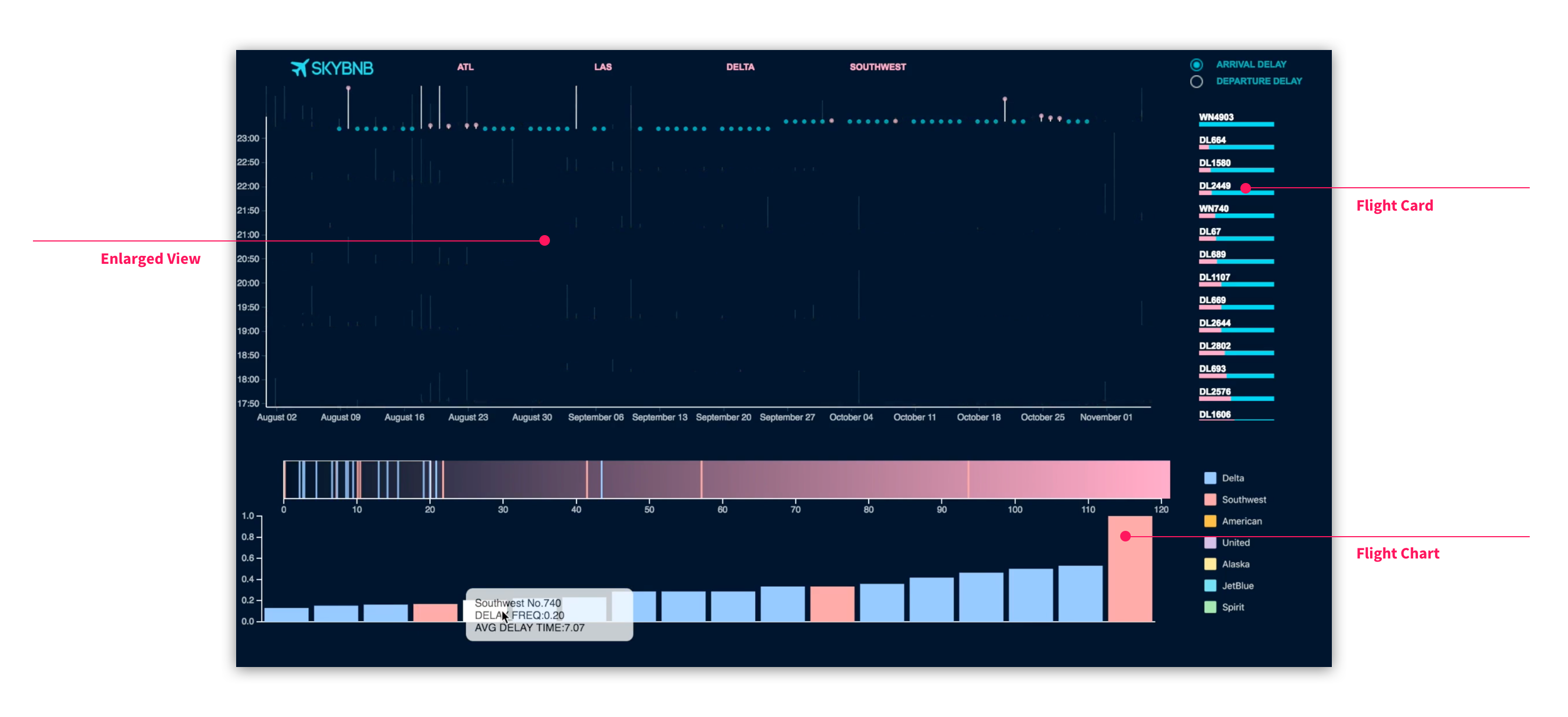
Our design proposal has multi-coordinated views, containing 4 parts: a menu bar at the top, an x-y coordinate view on the left, two bars section (contains 2 bars) at the bottom, and a cards list on the right.